Motion City Soundtrack
Poster Design
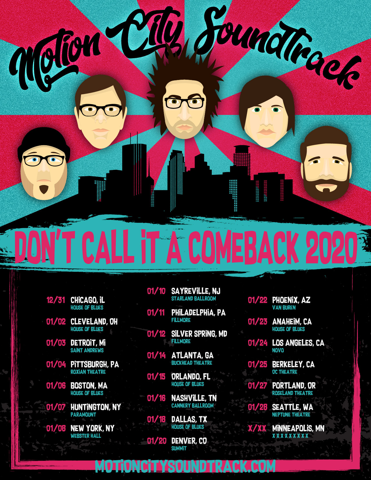
This is an uncommissioned work for one of my all-time favorite bands. When they announced in 2019 they were getting back together for a (not a comeback) tour, I had to show some love.


MCS has a two-tone color palette that they've used consistently in their design, so my choice of color was easy. Their design also commonly uses scratchy grunge texturing, which I used in the lower half of the poster.
The Band formed in Minneapolis, Minnesota, and they keep ties tight with their hometown. I think it's fiting to have the Minneapolis skyline as a central piece to the illustration.
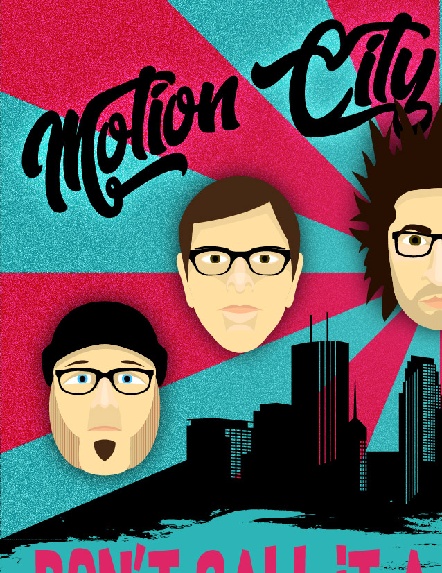
MCS is an emo / pop-punk band, and a lot of their songs deal with personal flaws, insecurity, self-destruction, and an underlying tone of irony. This poster is meant to evoke that same feeling: it portrays the band members like superheroes, larger than life figures towering above the city, against a triumphant comic-book-like burst of color. Their faces, however, are expressionless, except for the lead singer, with his somewhat iconic look of defiance.
The poster says at once, "Triumphant Return!", and "Don't Call it A Comeback". But in every way, it says "Motion City Soundtrack".